
“父相子绝”的定位口诀即将成为历史!CSS Anchor Positioning(锚点定位)正在颠覆我们对元素定位的认知。这个新特性让元素可以自由地锚定到页面任意位置,不再受DOM层级的束缚。
锚点定位初体验
想象一下:工具提示不再需要嵌套在父元素中,而是可以直接定位到页面的任何位置。这意味着你可以轻松地创建自定义的弹出框、浮动菜单,甚至是复杂的导航菜单。
1
2
3
4
5
6
7
8
9
10
11
12
|
.trigger {
anchor-name: --my-anchor;
}
.tooltip {
position: absolute;
position-anchor: --my-anchor;
top: anchor(bottom);
}
|
这是一次革命
传统定位的一些痛点:
- 层级限制:定位只能相对于最近的父元素进行定位。
- 多元素定位:传统无法同时参照多个元素进行定位,这限制了布局的灵活性。
- 自适应:定位元素的位置通常是固定的,无法根据屏幕尺寸进行自适应。
参考兄弟元素定位
1
2
3
4
5
6
7
8
9
10
11
12
13
14
15
16
17
18
19
20
| <style>
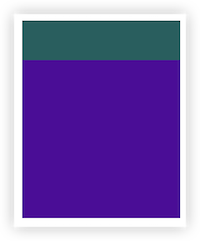
.anchor1 {
width: 200px;
height: 50px;
background-color: rgb(2, 95, 95);
anchor-name: --anchor1;
}
.target {
background-color: rgb(82, 3, 156);
width: 200px;
height: 200px;
position: absolute;
position-anchor: --anchor1;
top: anchor(bottom);
left: anchor(right);
}
</style>
<div class="anchor1"></div>
<div class="target"></div>
|
这样就完成了兄弟元素之间的定位。target的顶部和anchor1的底部对齐,target左侧对齐anchor1的右侧。
多元素定位
1
2
3
4
5
6
7
8
9
10
11
12
13
14
15
16
17
18
19
20
21
22
23
24
25
26
27
28
29
30
31
32
33
34
35
36
| <style>
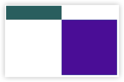
.cont {
display: flex;
gap: 100px;
}
.anchor1 {
width: 200px;
height: 50px;
background-color: rgb(2, 95, 95);
anchor-name: --anchor1;
}
.anchor2 {
width: 200px;
height: 200px;
background-color: rgb(2, 95, 95);
anchor-name: --anchor2;
}
.target {
width: 200px;
height: 200px;
background-color: rgb(82, 3, 156);
position: absolute;
top: anchor(--anchor1 bottom);
left: anchor(--anchor1 right);
right: anchor(--anchor2 left);
bottom: anchor(--anchor2 bottom);
}
</style>
<div class="cont">
<div class="anchor1"></div>
<div class="anchor2"></div>
</div>
<div class="target"></div>
|
这样将目录元素定位在了两个锚点元素之间,不再使用position-anchor属性,直接在anchor()函数中传入锚点的名称。
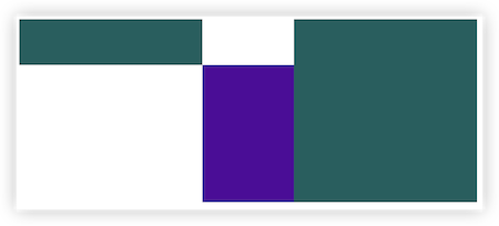
自适应
当前指定的位置空间不够时,自动尝试别的位置
1
2
3
4
5
6
7
8
9
10
11
12
13
14
15
16
17
18
19
20
21
22
23
24
25
26
| <style>
body {
padding: 300px;
height: 200px;
}
.anchor1 {
width: 200px;
height: 50px;
background-color: rgb(2, 95, 95);
anchor-name: --anchor1;
}
.target {
width: 200px;
height: 200px;
background-color: rgb(82, 3, 156);
position: absolute;
position-anchor: --anchor1;
position-area: bottom center;
position-try-fallbacks: top center;
}
</style>
<div class="anchor1"></div>
<div class="target"></div>
|
这样在页面滚动时,target元素会自动在上方和下方自动切换位置。
现在这个新特性已经被大多已经在chrome, edge浏览器中得到支持,但是其它浏览器还需要再等等
锚点定位里还有些其它属性,不一一介绍,有兴趣的自行发掘

