如果你需要画一个时钟表盘,你会怎么做?用12个div元素,使用CSS的transform属性来旋转它们,来将他们放在正确的位置。但是,你会发现,你需要使用JavaScript来计算每个div元素的旋转角度, 当前你也可以提前计算好,但终究是要计算的。一但钟表半径变化,你就需要重新计算。
那如何我们现在添加一些限制条件呢
1
2
3
4
5
6
7
8
9
10
11
12
13
14
| <div class="panel">
<div class="digit"></div>
<div class="digit"></div>
<div class="digit"></div>
<div class="digit"></div>
<div class="digit"></div>
<div class="digit"></div>
<div class="digit"></div>
<div class="digit"></div>
<div class="digit"></div>
<div class="digit"></div>
<div class="digit"></div>
<div class="digit"></div>
</div>
|
使用上面的html片段,不使用nth-*之类的选择器,不使用+选择器。纯CSS应该如何实现一个表盘呢
先添加一些基础样式
1
2
3
4
5
6
7
8
9
10
11
12
13
14
15
16
17
18
| .panel {
width: 200px;
height: 200px;
border-radius: 50%;
border: 3px solid #000;
position: relative;
}
.digit {
position: absolute;
left: 90px;
top: 90px;
width: 20px;
height: 20px;
display: flex;
justify-content: center;
align-items: center;
font-size: 14px;
}
|
填充12个刻度
再没有JS的情况下,我们可以使用::after伪元素来实现向页面添加显示内容。那1-12这些数字应该实现如何呢。在html中有什么情况会自动为元素填充序号呢?没错,有序列表。那我们这里其实也类似,在CSS中有counter功能
1
2
3
4
5
6
7
8
9
10
| .panel {
counter-reset: digit;
}
.digit {
counter-increment: digit;
&::after {
content: counter(digit);
}
}
|
这样每个div中都会显示一个数字。接下来,我们需要将这些数字旋转到正确的位置。我们可以使用transform属性来实现。问题是,我们如何知道每个数字的旋转角度呢?我们可以使用sibling-index函数来实现。这个函数可以返回一个元素在兄弟元素当中的索引。我们可以使用这个函数来计算每个数字的旋转角度。
1
2
3
4
| .digit {
--angle: calc((sibling-index() - 3) * 30deg);
transform: translate(calc(cos(var(--angle)) * 90px), calc(sin(var(--angle)) * 90px));
}
|
附上完整代码
1
2
3
4
5
6
7
8
9
10
11
12
13
14
15
16
17
18
19
20
21
22
23
24
25
26
27
28
29
30
31
32
33
34
35
36
37
38
39
40
41
42
43
44
45
46
47
48
| <style>
.panel {
width: 200px;
height: 200px;
border-radius: 50%;
border: 3px solid #000;
position: relative;
counter-reset: digit;
}
.digit {
position: absolute;
left: 90px;
top: 90px;
width: 20px;
height: 20px;
display: flex;
justify-content: center;
align-items: center;
font-size: 14px;
counter-increment: digit;
--angle: calc((sibling-index() - 3) * 30deg);
transform: translate(calc(cos(var(--angle)) * 90px), calc(sin(var(--angle)) * 90px));
&::after {
content: counter(digit);
}
}
</style>
<div class="panel">
  <div class="digit"></div>
  <div class="digit"></div>
  <div class="digit"></div>
  <div class="digit"></div>
  <div class="digit"></div>
  <div class="digit"></div>
  <div class="digit"></div>
  <div class="digit"></div>
  <div class="digit"></div>
  <div class="digit"></div>
  <div class="digit"></div>
  <div class="digit"></div>
</div>
|
效果如下
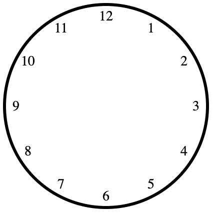
兼容性
目前只有chrome最新版本支持这个函数,其他浏览器还没有支持。谨慎使用

